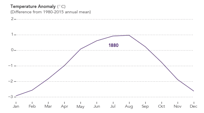
Last Month I reported that July 2016 was the Hottest July ever in human history. Now that we have the raw data for August, we can take a peek and see if it is following the ongoing trend.
So is it?
OK, so I was being a tad dramatic last month when I used the qualifier “ever in human history”. The precise definition is that it is the warmest since we started recording precise numbers each and every month in 1880.
Here is a visualisation of the raw data. It comes from the NASA Earth Observatory site …
Well yes, but this has happened before … right?
xkcd creator Randall Munroe has created a graphic picture that illustrates the past 22,000 years to show you that what has just happened is completely unprecedented.
There have been some -ve comments about combining paleoclimate data with the present temperature record. The criticism is perhaps appropriate because he combines data extrapolated from models with actual measurements, so in a scientific sense, most would choke upon this if it had been presented within a scientific paper. Oh but wait, it is not a scientific paper, and is instead simply a cartoon designed to drive home a rather important point.
One of those criticising the graph, Chris Colose, does indeed agree that what is now happing is unique.
8/8 But big picture is world w unabated emissions gives 1-2 ice ages of warming over centuries and far outside envelope in millions of yrs.
— Chris Colose (@CColose) September 12, 2016
OK, so not a scientific model, and instead just an illustration of what we are now doing, and so in that context it is indeed a really great way to communicate that. Here is the xkcd graph, and also below. You will need to scroll quite a bit …

Should we be worried?
Well let me put all this another way …
- The two hottest months the world has ever recorded, last July and then last August, have just happened back-to-back.
- We are about to have back-to-back the two hottest years ever recorded, 2015 and now 2016
- Sea levels are rising
- Carbon dioxide in the atmosphere is at its highest levels in eons.
Doing nothing is not an option.
