Sometimes a few pictures is a more powerful statement than many pages of words.
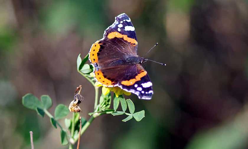
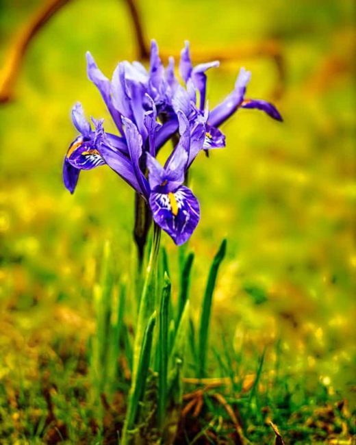
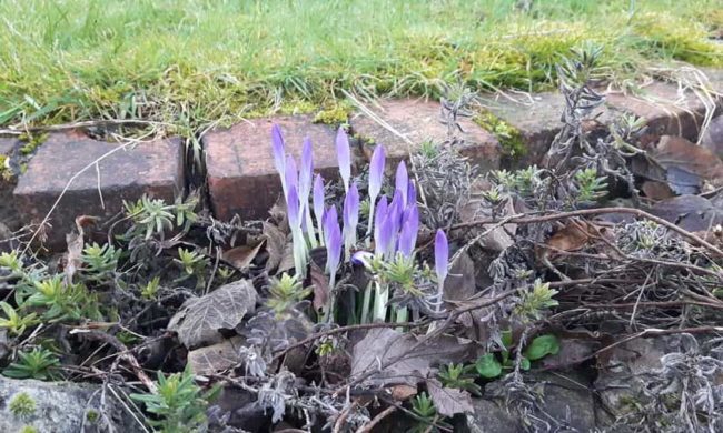
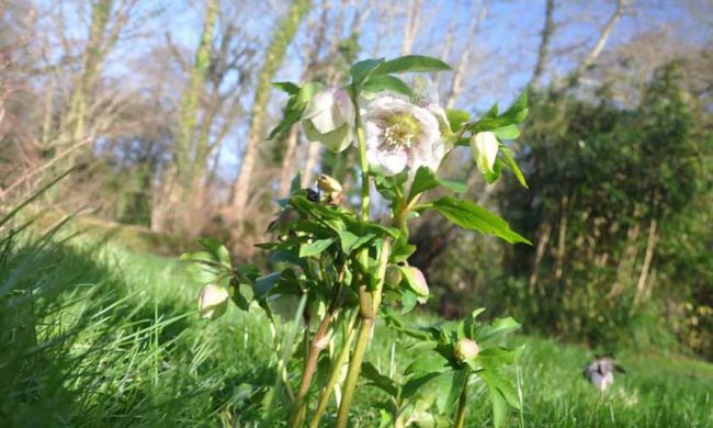
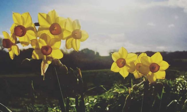
The UK’s Guardian has a callout here for readers to send in pictures of any early signs of spring in the UK. What came back was published a few days ago last Tuesday (13th Feb) …
‘A first in my 60 years’: readers spot early signs of spring
Readers around the UK have been getting in touch after noticing blooming and blossoming ahead of time
Here is a small selection of the pictures, and as you look, remember that it is still the middle of February …

A second different set of pictures
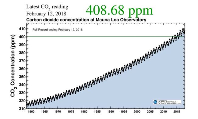
Now let’s rapidly shift to a distinctly different set of pictures to explain why signs of spring have been popping up earlier. This time it is a series of charts, the Keeling curve no less, that illustrates the amount of CO2 within our atmosphere …
Since the 1960’s …
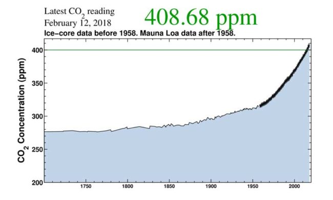
Scale back and here are the numbers since 1700 …
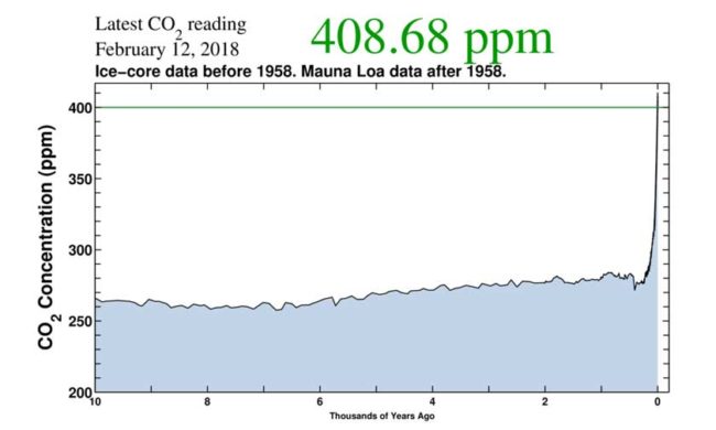
Zoom back even further and here is the past 10,000 years …
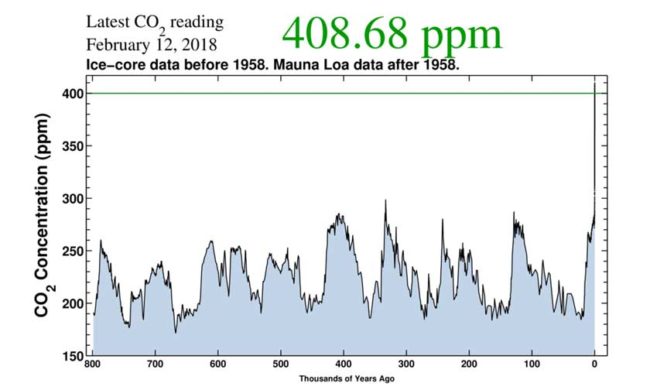
Step right back to the very limits of the ice core data and here it is in the context of the past 800,000 years …
While it is nice to see signs of spring popping up, the fact that it is happening this early is just one more symptom of a rather more important message. That message is essentially this …
The business as usual scenario is one in which we are basically F**ked.
