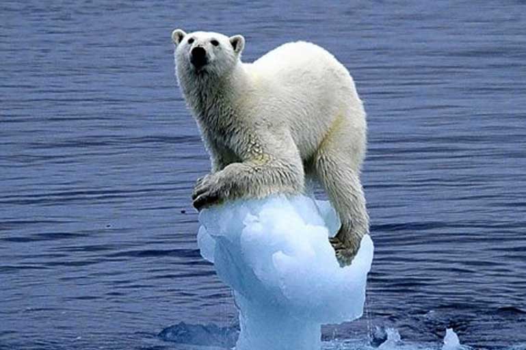
Thinking about how you say something is rather important if you need to effectively tell a story.
Presenting an array of numbers such as the following will simply not cut it because it does not effectively convey the saga of what is actually going on, even if the numbers are meaningful and accurate.
2013 64.570 322.000 0.16 0.18 0.22 0.21 0.07 0.09 0.00 0.00 0.00 0.00 0.00 0.08

2013 64.710 321.990 0.23 0.21 0.25 0.25 0.12 0.12 0.00 0.00 0.00 0.00 0.01 0.10

2013 64.840 321.980 0.31 0.23 0.26 0.29 0.17 0.14 0.00 0.00 0.00 0.00 0.01 0.11

2013 64.980 321.960 0.33 0.25 0.28 0.31 0.22 0.15 0.01 0.00 0.00 0.00 0.02 0.13

2013 65.110 321.950 0.29 0.25 0.26 0.29 0.24 0.16 0.01 0.00 0.00 0.00 0.03 0.13

2013 65.250 321.940 0.22 0.21 0.22 0.24 0.24 0.16 0.01 0.00 0.00 0.00 0.04 0.11

2013 65.380 321.920 0.17 0.16 0.19 0.21 0.22 0.16 0.02 0.00 0.00 0.00 0.04 0.09
However, render such numbers into a graph, and suddenly the story comes to life. With that we can then see what has been happening over the past few decades to the #arctic sea ice thickness and volume – it is on ongoing tale of decline.
Now let's look at mean (monthly) #Arctic sea ice thickness. Large interannual variability w/ overall thinning. 2017 lowest January on record pic.twitter.com/V73Yziymxt
— Zack Labe (@ZLabe) February 5, 2017
While there is large year-to-year variability, follow the overall trends in January #Arctic sea ice volume (PIOMAS, satellite era) pic.twitter.com/V9bhL1Ug4N
— Zack Labe (@ZLabe) February 4, 2017
#Arctic Death Spiral – Jan 2017 average vol: 14,695 km³ (last year 17,234 km³, prev record: 2012 15,862 km³). This is shocking. pic.twitter.com/9Kc8Q9BPwp
— Andy Lee Robinson (@ahaveland) February 4, 2017
Preliminary reanalysis (NCEP/NCAR) for January 2017 in the #Arctic (66°N+). Notice large interannual variability + trend (surface temps) pic.twitter.com/d8I8CBhh5B
— Zack Labe (@ZLabe) February 2, 2017
The on-going unfolding story
It is dramatic and also a slow continuous unfolding story, so slow that perhaps we don’t appreciate what is happening over the longer time span of decades.
The key of course is the obvious warming of the global climate and so the shrinking #arctic sea ice is the canary in the coal mine warning us.
Utqiaġvik (Barrow) early winter (Nov thru Jan) average temp since 1920-21. Trend since early 90s is stunning. #akwx #Arctic @Climatologist49 pic.twitter.com/9D194rEqeJ
— Rick Thoman (@AlaskaWx) February 3, 2017
And this week …
The #arctic weather is once again warming up way above normal …
https://twitter.com/EricBlake12/status/827900745756327936
In Summary
Being an effective communicator with an evidence-based message is the ideal.
Having the data is not enough, you need to be able to tell a story and use graphics that capture and communicate what is happening. The graphics need to be able to gain attention by telling the unfolding story in a manner that does not simply impart facts, but also resonates with the human heart.
We are in essence driven by emotions and so if decisive meaningful action is to happen, then people do need to hear more that dry statistics, they also need to grasp at a deeper level the unfolding drama.
