Somebody was once telling me about a visit to a church they made when they were on vacation. It was excessively dynamic. The rhythm and the music reached out, caught them up, and carried them along in a tide of emotion. The language might indeed have been different, and while they might not have actually believed what the folks there believed, they still connected. As a contrast, tune into a technical presentation within the scientific community and you may find yourself at dire risk of being entrapped within the enticing tendrils of a soporific effect as slide after slide of numbers swoosh rapidly by. It’s not you. What is being communicated might indeed be fascinating and deeply significant, so clearly the problem is the manner in which the information is being expressed.
Climate Change Graphs
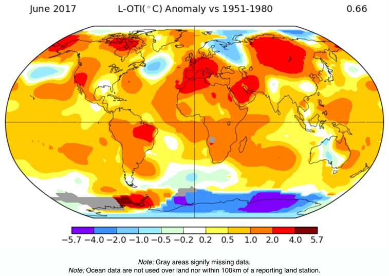
Now don’t misunderstand me here, I’m not suggesting that there is a need to jazz up a presentation by hiring a band. Instead, what I’m actually getting at is that raw data can be converted into something that is far more visual and meaningful, to enable people to grasp what is being communicated.
GISTEMP – GISS Surface Temperature Analysis
Back in the 1970’s James Hansen came up with the basic GISS temperature analysis scheme. This is a method of estimating global temperature change. If curious, then it is fully documented in Hansen and Lebedeff (1987). What we have within the GISTEMP dataset is a calculation of global surface temperature change for every single month going back to 1880.
You know that this is important because it is expressing something that truly does need to be effectively communicated. Unfortunately, a list of numbers is not the way.
The solution is to render it into a graph and so you can perhaps express it like this …
Temperature anomalies arranged by country from 1900 – 2016
There is always scope for finding a better way to express the same information, and so here is an example of exactly that.
Antti Lipponen, a physicist at the Finnish Meteorological Institute, has come up with a graphic that breaks down the numbers by country and then through a series of sequences, shows you just how universal and global the warming trend is.
The folks over at Climate Central also really like it as well …
step back to look at the graphic as a whole and it’s clear we’re all in this together. No country is immune from rising temperatures, let alone the other impacts of climate change.
It’s also clear that global warming is accelerating. In the past three decades (which starts around the 14-second mark in the video), the bars start pushing further and further from the center. Cooler-than-normal years start to become more rare and by the 1990s, they’ve almost disappeared completely.
The past three years have been the hottest ones ever recorded. A number of countries were more than 2°C warmer than the 1951-1980 baseline used in the graphic. That puts them well above the warming limit enshrined in the Paris Agreement, serving as a warning of how fast we’re pushing into new territory.
The world itself touched 1.5°C above pre-industrial levels for a few months in 2016. If global warming permanently crosses that threshold, it will likely cause small island states to be swallowed by the sea, coral to die and heat waves to become more common and severe.
Those numbers alone are abstract, though. Even plotted on a line graph, they fail to fully convey the trajectory we’re on.
Lipponen said he made the animation because he wanted a “nice looking, clear, and informative” way to convey that information in a way people can understand. Mission accomplished.
Indeed yes, he really has nailed it.
Tweets
https://twitter.com/anttilip/status/892318734244884480
